27 PLACES THAT YOU COULD NEVER BELIEVE EXIST


After exploring a lot of differing techniques and processes I felt it was time to start thinking about how they could be employed with an effective contextual result. I felt that the images I had been creating were saying a lot about contemporary times and how we see and experience images. One theme that I had been consciously thinking about in connection to this project was this new phenomenon of click-bait. Im sure than any person using Facebook or any social media has been in the past year will have been exposed to click bait even if they are not aware of it. The main offender for the most part is BUZZFEED. Theses catchy prompt headlines have one aim and that is for you to click their link. Often theses titles will be wildly spurious or just intentionally controversial but more often than not they are terribly annoying.   

As a quick exercise into the unimaginativeness of click bait, I created theses telling examples using a ‘click bait link generator’, if you can believe such thing exists. So here are 12 times Tommy Harpin tried his hardest to be amusing:

Why Tommy Harpin's photography is destroying america

10 ways marketers are making you addicted to Tommy Harpin's photography

11 things the media isn't telling you about Tommy Harpin's photography

How Tommy Harpin's photography can make you filthy rich

guns don't kill people -- Tommy Harpin's photography kills people

Why Tommy Harpin's photography sucks

10 Tommy Harpin's photography secrets the pros won't tell you

10 Tommy Harpin's photography myths busted

Why you should forget everything you learned about Tommy Harpin's photography

8 things the media hasn't told you about Tommy Harpin's photography

Tommy Harpin's photography dies every minute you don't read this article

12 reasons Tommy Harpin's photography is the end of the world as we know it


Regardless from making silly headlines about my self I thought that there was an interesting path to start to explore in relation to theses articles that seemed to be appearing all over the web. there were two that partially caught my attention as I saw an opportunity for images to be made. 

27 Incredibly Beautiful Places You Won’t Believe Actually Exist

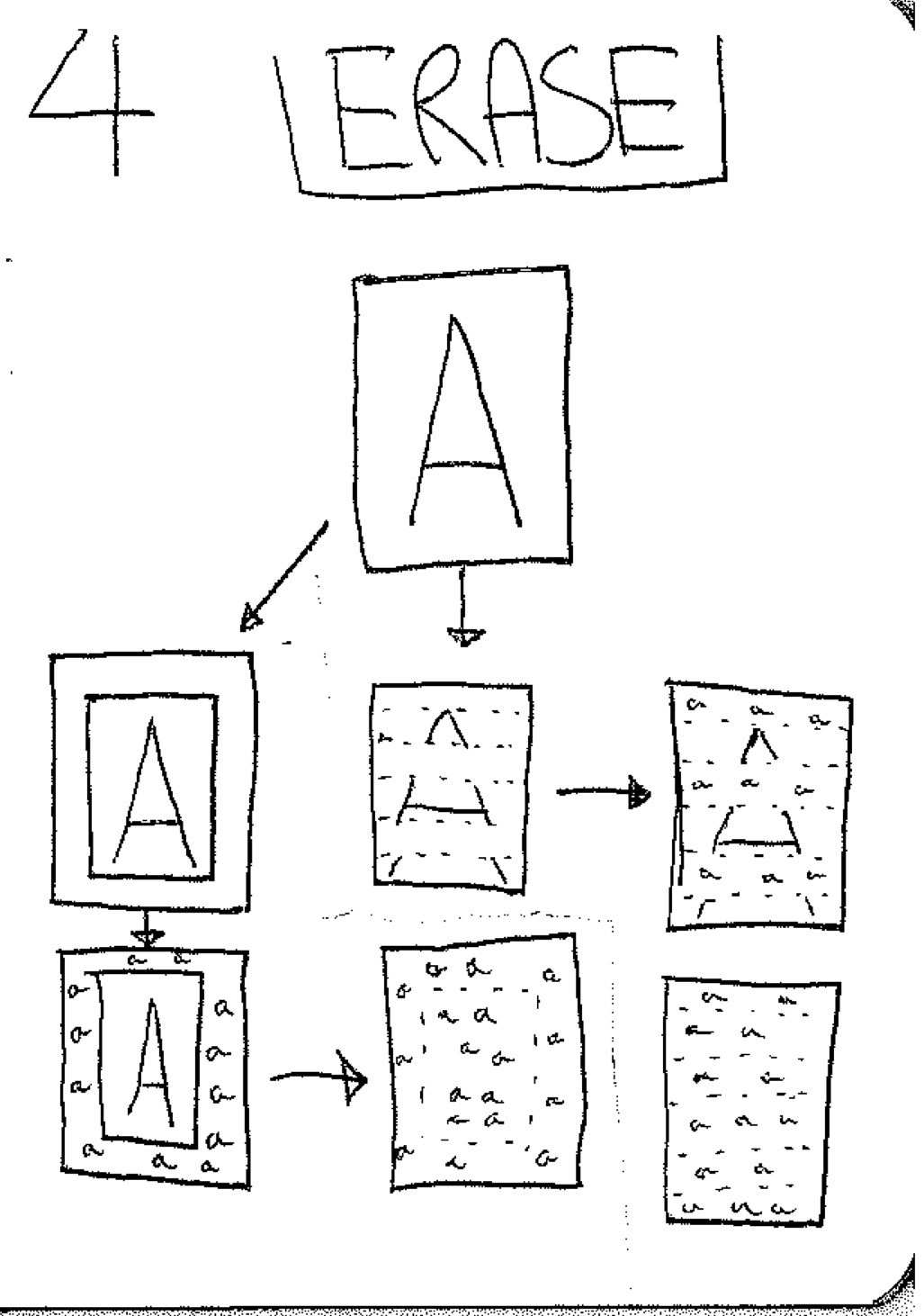
I will start of with this title and introduce the other in another post for now, but one of the most popular posts on Buzzfeed was this list of places you wouldn't believe exist. I when I saw this post I knew that I had to utilise the ‘Erase’ process that I had been working on. Instead of places you wouldn't believe exist I wanted to turn this into to places that you could never believe existed. In some of the images i kept repeating the the process or erasing until the image was barely any detail left, where as others i retained some of the visual information when i felt it was appropriate.. In this sense i felt that the work was closer to Robert Rauschenberg’s ‘Erased Van Kooning’ than any of the previous work that i had been creating. Overall what was created were these perplexing mixes of shapes, colour and abstract form. I feel that the images are working well and I've started to engage with the idea of appropriation in an effective manner. There is a humorous aspect to the series and one that stems from postmodern irony. I feel that my work its self has returned from being quite brutal and harsh to experience to something that feels a lot more engaging. 


TEST 2 - DOUBLE ANGLE


In this second test I wanted to try and implement this process of using twin cameras to make imagery. Like before with the still images I expanded the canvas adding two channels of video side by side with a gap between. By splitting the frames and deleting the blank space each image rushed to fill the void. The actually footage is quite bland  but instead this was intended as a screen test for this experimental method. Just like the first two clips there is a blend between the predetermined carved out space for this images to inhabit combined with elements of the surreal and uncanny. I feel that theses approaches are not working as well as I had anticipated. The big distortions that are made to the video creates something really hard to look and at enjoy. I had an exception for this moving work to become enthralling and mesmerising just at the still image have proven to be. But I feel that the rapid changes begins to drag the work aware from mesmerisation and into a atmosphere of confusion. 


SACHA TESTS

I have been interested with what some of the approaches i have been using might create when exposed to figure especially with moving image. I wanted to start experimenting with a process I will call ‘Erase’  and implement this with moving image. This disruptive process erases all original content from the file so all that is left is a distorted version of what once appeared.  This structural way of working created an incredibly challenging piece of moving image to look at. When working in this manner there isn almost predetermined outcome from the approach. Combining a sense of the surreal and the predetermined starts to confuse the borders between two quite opposing themes and honestly i feel that its a little lacklustre in its results, especially compared to some of the other methods I've been working on. I feel that there is more to be worked on with the figure and feel that a few of my other ideas and methods might be more successful. 


ARTIST


Leading on from the Malevich series I wanted to experiment with other works of art. I wanted to chose work that i thought might create some quite graphically bold images in return. with the exception of Warhol’s Monroe screen prints each of the works falls under this category of minimalism and you could argue that each has been heavily influenced by the work of Malevich. There was a element of me poking fun at the original works of art for not really saying much other than expressing shape and form. Manipulating each of these images exaggerates and twists the ideal forms that have been carefully crafted. Allowing photoshop to destroy this image has its own connotations, i find theses images really fascinating but i feel that one of the keys factors to this is my fascinations with the originals. As quite ironic pieces of postmodern work i think they work well but to really turn these into a series they need a little more thought and consideration. 

MALEVICH


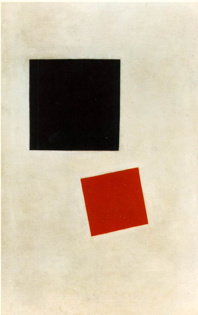
Kazmir Malevich has always been an idol and had influence over a lot of my artistic and photographic practice. His revolutionary Suprematism theories and practice helped redefine ideas of how we see and experience art. He was the first person disregard everything but form. His incredibly minimal paintings were the first of their kind and opened up ideas for many of the great modernists since. I wanted to use some of Malevich’s work and appropriate just to start ask the question of what are we really looking at. This particular painting ‘Black Square and Red Square’ is one of my favourite pieces by the artist. Despite it being created from just two shapes and three colours some how it seem so considered. If the titled square was just titled a few more degrees would this piece still work so well?. I decided that it should not be me intervening with the work but instead let photoshop manipulate this piece all on its own.  I repeated the process (expanding the canvas and deleting the blank space with content aware) five times and got very different results. Each time a new piece of art was created and each time a new sense of character distorted this three colours and two shapes.  Instead of looking at work by Malevich we see a strange hyper reality of a Malevich painting. 


FRONT PAGE

After exploring some of the themes of our globalised world mixed together with the exposure we see of it through news outlets. I wanted to create these full paged images from various websites that conveyed a sense of connect and disconnect. The idea was to create this image where we understand a little of what is going on but theres so much of it that the audience is left feeling some what perplexed. What differed with this series of images is that once the white space had been deleted and filled with the content aware computer generated mess, the inverse was selected and deleted again. The images and text had informed what should replace the blank space, this outer edge was then used to inform what should replace the original images and text.  Creating this Chinese whisper style pattern that vanished all the original content. Within this, the visual information that we receive is even more spurious, in a way reacting to people perceptions of the news. The imagery created is utterly absurd yet becomes quite interesting to try and pick out bits and pieces of this jumbled mess.


Even though I really like the images I've created here I feel that the path has sort of come to an end. They only thing I could do would be to create an image like this every day for the rest of the project. Although it would be really interesting to then look back on this strange vision of the past weeks  I want to continue experimenting and implementing the processes I've uncovered. I think that this approach where by the image is expanded and then the original content its self is deleted could be very interesting to explore. 


NIGEL

Leading on from my BIG NEWS piece, I felt the need to being experimenting with other ways that I could use the news as source material for some of my work. This idea of connection and disconnection really resonates within current times. Sometimes we can feel as if there is simply too much going one. As we become opened up to events happening constantly it is very easy to become entangled within a strange confused paranoid state. What this series aimed to do was to visually represent that idea of uncertainty and disoriented perception. These images were created by simply screen shooting front pages of news website and deleting all the white space that surrounded both image and text. In some ways this creates a sort of portrait for the news that day. The big stories with the largest images dominated the page, where as the smaller images create strange patterns and juxtapositions between. The images themselves, even though being hugely puzzling, conveys aspects of the satirical or even farcical. It becomes quite surreal to see Nigel Farage’s thumbs up woven between an ethnic couple.  

 I plan to continue this exploration of process and sources, I feel that capturing a full length webpage might be quite interesting as the stories and images mix together as we scroll down the page. Of course news stories are constantly updating and capturing these images and presenting them as if they were major events comes with its on connotations and is something i'll have to be aware of as I continue to experiment.